Dominic Eburuoh.

Design Engineer · Product Designer · Full-stack builder

I design the interface, then I ship it.

I'm a design engineer who takes products from a blank Figma frame to the App Store. I own the whole surface: the research, the flows, the visual system, the React and Swift that render it, and the database rules underneath. Recent work spans fitness, invoicing and property management, with AI and real-time voice running through most of it.

3products designed and built end to end
11codebases across web, iOS, Android and backend
10industries and domains shipped into
1person across design, front end, native and data

Capabilities

The full toolkit, from research to release.

Design engineering lives in the gap between the mockup and the merge. These are the skills, tools and frameworks I use across that gap. Items marked in red appear in the case studies.

Used in shipped work

Industries

Where the work has landed.

Each industry has its own regulations, vocabulary and expectations. Learning those quickly is part of the job.

Health & FitnessHabit formation, streaks, accountability and gym check-ins.GymBuddy
Digital wellbeingScreen Time, app blocking and designing friction that helps.GymBuddy
Consumer socialBuddy pairing, nudges, cheers and shared progress.GymBuddy
Fintech & invoicingInvoices, quotes, receipts, VAT details, multi-currency and payment status.Billery
Small business & sole tradersStudios, clinics, tutors, kitchens, market stalls and trades.Billery
Developer platforms & APIsAPI keys, test mode, idempotency, rate limits and webhooks.Billery
PropTech & real estateLandlords, letting agents, tenancies, EPC data and listing portals.BethyAI
AI & conversational voicePhone agents, speech-to-text, LLM tool calling and grounded assistants.BethyAI · Billery
B2B SaaSMulti-tenant workspaces, teams, roles, billing and reporting.BethyAI · Billery
Trades & field servicesJob notes from calls and site visits, maintenance and scheduling.BethyAI
More on the wayCase studies from other industries are being written up now.Coming soon

How I work

One loop, no handoff.

Because I design and build, the decisions made in Figma survive into production and the constraints found in code flow back into the design the same day.

Stage 1FrameTalk to the people with the problem. Name the one job the product must do and what success looks like.
Stage 2FlowMap journeys, states and edge cases, including empty, error, loading, locked and offline, before any pixels.
Stage 3SystemDefine tokens for colour, type, spacing and radius, with semantic names both design and code share.
Stage 4BuildPrototype in the real stack early. Tune motion, haptics and copy on a device, not a canvas.
Stage 5ShipStore listings, marketing sites, analytics and docs. Then watch real use and loop back to stage 1.
← All workCase study 1 of 3

Health & Fitness · Digital wellbeing · Consumer social

GymBuddy

An iPhone app that locks your most distracting apps on gym days until you check in at the gym with a photo.

Role

  • Product design
  • Brand & design system
  • React Native + native Swift
  • Backend & App Store launch

Platforms

  • iOS 16.4+ (primary)
  • Android build target
  • Marketing site

Status

Stack

Expo SDK 57React NativeTypeScriptScreen Time APISwiftVisionMapKitSupabaseZustand

The problem

People don't skip the gym because they lack a plan. They skip because Instagram, TikTok and YouTube are one tap away when it's time to leave. Reminder apps are easy to swipe away. Habit trackers only report the damage afterwards.

I wanted to put a real, system-level cost on skipping, remove it the moment you show up, and make it social enough that a friend notices too.

What I built

You pick the apps that pull you in, set gym days and a time window (say Mon, Wed and Fri, 6 AM to 8 PM), and those apps lock when the window opens. At the gym you snap a photo of the kit around you. The phone checks on-device that it looks like a gym and everything unlocks for the rest of the day.

Pair with a buddy using a 4-digit code or QR card and you see each other's check-ins and streaks, with nudges and cheers delivered as push notifications.

The app, screen by screen

Captured from the current iOS build. The names, streaks and buddies are fictional demo data I built for App Store screenshots, generated relative to the current time so every screen agrees with the others.

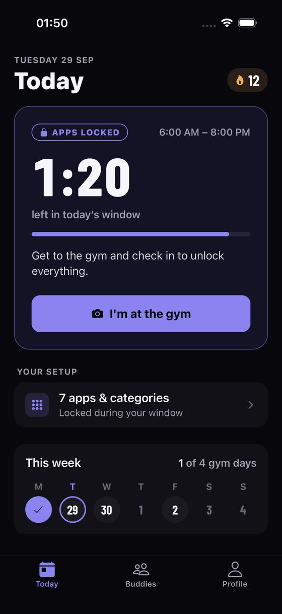
01 · Today, lockedOne job on screen: get to the gymOn a gym day the hero card turns violet and says the apps are locked. A big condensed countdown shows the time left in the window, a progress bar shows how much of it has gone, and there is exactly one primary action: I'm at the gym. The week strip below counts gym days done.
02 · Check inProof, without the paperworkA full-screen camera prompt with plain instructions: the rack, your kit, the view from the treadmill. The unlock button stays disabled until there is a photo. Apple's Vision framework classifies the photo on the phone and it is never uploaded.
03 · BuddiesWho still needs to go todayA segmented bar splits the group into checked in (green), still to go (amber) and resting. Nudges from friends sit in a highlighted inbox, requests come next, and filter chips plus Nudge all make it quick to chase the whole group.
04 · ProfileProgress you can read in a secondFour stat tiles (streak, best, this month, attendance) sit above a 12-week consistency grid. Violet is checked in, muted amber is missed and dark is a rest day, the same semantic colours used across the rest of the app.
05 · Rest dayThe same card, calmerOn a rest day nothing locks. The card drops its accent, counts down to tomorrow's lock instead, and says one line: Nothing locks today. Recover well. Rest is part of the plan, so the UI treats it that way.
06 · Sign inOne tap, and a privacy promise up frontSign in with Apple or Google, new or returning, with no passwords or codes. The line under the buttons answers the obvious worry before anyone asks: GymBuddy never sees which apps you lock.

Design decisions

The choices that shaped how the app looks and behaves.

  • Three semantic colours, nothing elseThe whole app speaks in violet for locked, green for unlocked or checked in, and amber for needs attention. Every card, pill, border and background tint derives from those three, so you can read the state before you read a word.
  • A chosen dark neutralDark-only, on a violet-biased charcoal (#08070C to #24222E) so the greys sit with the brand purple instead of reading as stock grey. Dark text on the accent keeps buttons at AA contrast.
  • Strict, never stuckNo snooze button, but apps always unlock when the window ends. A short grace period gets you out the door, and strict mode blocks editing the schedule while you're locked. Firm enough to work, never a trap.
  • Privacy as a featureApple holds the locked-app list, so even the backend can't see it. The check-in photo is classified on the phone and never uploaded. Account deletion lives in Settings. These points went into the App Store copy as selling points.
  • Condensed numeralsBarlow Condensed for countdowns, streaks and dates borrows the look of gym clocks and scoreboards. Body text stays neutral and legible on an 8pt spacing grid.

Design evolution: the first build

The first complete build in early September 2026 was light, with a saturated indigo accent, and it covered the full flow from onboarding to pairing. The second pass moved to the dark system above: the same structure, but state colours carry the meaning and the accent is reserved for the locked state. These are real simulator captures from that first build.

Pick your weaknessesOnboarding step 1. Choose the apps that get locked. Apple keeps the list private.
Set your scheduleGym days as toggle pills, and the lock window set with steppers instead of a fiddly time wheel.
The iOS shieldWhat you see when you open a locked app. Designed through a ShieldConfiguration extension: streak, distance to the gym and a buddy's check-in.
Share your pair cardA QR card with your gym and schedule, shareable as a link, full-screen code or Apple Wallet pass.

Engineering highlights

Three native iOS extension targets sit alongside the React Native app: a DeviceActivityMonitor that locks and unlocks on schedule, and ShieldConfiguration and ShieldAction extensions that design the system screen you see when you tap a blocked app. They share state through an App Group.

Two custom Expo native modules in Swift: gym-vision runs Apple's Vision image classifier on-device to confirm the photo looks like a gym, and gym-search uses MapKit local search filtered to fitness points of interest for onboarding.

A config plugin adapts the app to the UIScene lifecycle. Sign in with Apple and Google, universal links for pair invites, and push notifications for nudges all run on Supabase.

Launch craft

I wrote the full App Store listing within Apple's character limits (name, subtitle, 170-character promo text, 4,000-character description and keywords) and designed the App Store screenshot frames. The marketing site at gymbuddy.live reuses the app's exact colour values, so the product and its site read as one brand.

System

background#08070C
surfaceAlt#1B1A23
accent#8B84F0
success#5FD08F
warning#F0B35B
← All workCase study 2 of 3

Fintech · Invoicing · Small business & sole traders · Developer API

Billery

A web app where you describe the job in a sentence, or say it out loud, and get a branded invoice ready to send.

Role

  • Product & UX design
  • UI and design system
  • Full-stack engineering
  • Public API design
  • Landing page

Surfaces

  • Web app (Next.js)
  • Installable PWA
  • Customer share links & PDFs
  • REST API, webhooks & docs
  • Marketing site

Business model

  • Free plan with document limits
  • Pro at £10/month
  • No per-seat pricing
  • billery.io ↗

Stack

Next.js 16React 19Tailwind v4Prisma 7PostgreSQLNextAuthOpenAI toolsStripereact-pdfZod

The problem

For studios, clinics, tutors, kitchens, market stalls and anyone working out of a van, invoicing is admin squeezed in after the actual job. Most tools are built for accountants: dense forms, per-seat pricing and a dozen settings before the first invoice goes out.

The bar I set: job done to invoice sent in three steps, on whatever device is in your hand.

What I built

A billing workspace with four areas: Home, Customers, Invoices and Quotes. Home is a conversation: you describe the job and Billery creates the invoice, quote, receipt or customer. Forms are still there for people who prefer them.

Invoices go out as branded PDFs and share links your customer opens without an account. Everything is tracked from draft to sent to paid, and the same workspace can be driven from your own systems through a public API.

Inside the app

A walk through the web app in the order someone uses it. Captured from the app running locally with a fictional design studio's clients, invoices and quotes.

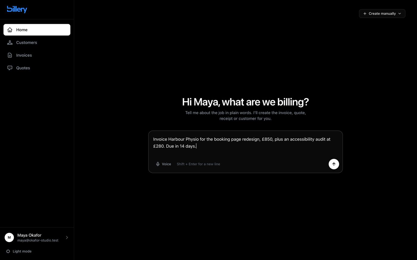
01 · Home"What are we billing?"Home isn't a dashboard. It's one question and one box: describe the job, who it's for and what to charge, and Billery creates the invoice, quote, receipt or customer. A Voice button dictates into the same box, and Shift + Enter adds a new line for longer jobs. People who prefer forms can use Create manually in the corner for a new invoice, quote or customer.
02 · New invoiceAI inside the form, tooThe manual form keeps a highlighted Generate line items with AI panel above the line items. Describe the job in plain language and it drafts the items with quantities and prices, which you then edit in the table below before saving.
03 · InvoicesOne table for everything you've billedNumber, customer, issue and due dates, amount and a status pill: grey for draft, blue for sent, green for paid, red for overdue. Receipts live in the same list with a small Receipt tag rather than in a separate section to go looking for.
04 · InvoiceThe document, with its next steps on topThe invoice reads like the PDF your customer gets: line items on an inverted header band, subtotal, VAT and total, then notes. Everything you can do next sits in one row: Download PDF, Share PDF, Mark as Paid, Edit, and a red Delete kept apart from the rest.
05 · What the customer seesA link, not an accountEvery invoice and quote has a private share link. Your customer opens it on any device and sees your business name, the document and a Download PDF button, with nothing to sign up for.
06 · QuoteYes turns into an invoice in one clickQuotes share the invoice layout, with a validity date instead of a due date. When the customer agrees, Convert to Invoice carries the customer, line items and totals straight across, so nothing gets retyped.

Also in the app

CustomersClients with their history

A customer table with invoice and quote counts, and a detail page with editable contact details, total invoiced and every document's status.

SettingsPaperwork that matches yours

Currency, numbering prefixes, and toggles for exactly which business details appear on invoices, quotes and receipts.

BillingVisible plan limits

Usage meters for the free plan and a single upgrade to Pro at £10 a month through Stripe.

DevelopersKeys, webhooks and docs

Self-serve API keys, signed webhook endpoints and a built-in API reference covering auth, test mode, rate limits and idempotency.

ThemesDark and light mode

A sidebar toggle switches the whole app, with status colours keeping their meaning in both.

OnboardingOne short form

Name, company, address and logo up front, so the first invoice already carries your branding.

07 · On a phone

The same app in your pocket

Billery installs to the home screen as a PWA. On a phone the sidebar collapses, the home prompt fills the screen for dictating on the go, and the invoice table turns into stacked cards with the number, customer, date, amount and status.

Design decisions

The choices that shape how Billery feels to use.

  • Conversation first, forms always availableHome opens on one question rather than a dashboard, because the thing people come to do is bill a job. Every AI path has a manual equivalent one click away.
  • AI drafts, the person decidesThe model fills in the line items, but every field stays editable and nothing is sent until you press send. The AI is a faster keyboard, never an autopilot for someone's money.
  • The screen looks like the paperInvoice and quote pages mirror the PDF the customer receives, so what you check is what they get.
  • One status languageDraft, sent, paid, overdue and accepted each have one colour, used identically in tables, detail headers, customer history, light mode and phone cards.
  • Zero friction for the payerCustomers never sign up. They get a PDF by email or a share link that works on any device.
  • Monochrome UI, one brand colourThe interface is black, white and greys, with the brand blue kept for the logo and status colours kept for meaning. Content and state do the talking.

The landing page

A separate Next.js marketing site, written to answer the questions a sole trader actually asks, in the order they ask them. Captured from the current site.

Hero"Billing that takes a sentence", with the full loop shown on the right: request, draft, invoice, paid.
How it worksAdd a customer, describe the work, send or share.
PricingFree, then one Pro plan at £10 a month. No per-seat maths.

Engineering highlights

Typed AI tools. The assistant acts only through a small set of typed functions (search and create customers, create invoices, quotes and receipts, list recent documents), which keeps it grounded in the account's data and easy to audit.

A public REST API designed for developers. Create invoices, quotes and receipts from a booking form or shop, with optional email delivery in the same request. Test keys validate and price exactly like live keys but write nothing and email nobody. Idempotency keys make retries safe, each key is rate limited, and webhooks are signed.

Prisma on PostgreSQL, NextAuth with password reset, Stripe Checkout and billing portal, PDF rendering with react-pdf, and Zod validation throughout.

# Create and send an invoice from your own system
POST /api/v1/invoices
Authorization: Bearer blry_test_…
Idempotency-Key: order-8812

{
  "customer": { "email": "sam@studio.co" },
  "items": [
    { "description": "Brand refresh",
      "quantity": 2, "unit_price": 350 }
  ],
  "send_email": true
}

Where it started

Billery v1 (2025) was a cross-border billing tool for freelancers, with currency accounts in GBP, USD and NGN, built on Next.js 13, Redux Toolkit and Bootstrap and opening on charts. The rebuild swapped that dashboard-first design for the conversation-first one above.

← All workCase study 3 of 3

PropTech · Property management · AI & voice · B2B SaaS

BethyAI

An AI property manager for landlords and letting agents. It answers the phone, triages maintenance, finds a tradesperson and only asks you to approve the cost.
Role

  • Product strategy & UX
  • Conversation & voice design
  • Dashboard & mobile UI
  • Real-time systems

Surfaces

  • Landlord dashboard (web)
  • Tenant app (iOS/Android)
  • AI phone receptionist
  • WhatsApp channel

Market

  • UK landlords
  • Letting agents
  • Property management companies
  • bethy.ai ↗

Stack

Next.jsSupabase + RLSTwilio Media StreamsDeepgram Voice AgentGroqWebSocketsExpo RouterGSAP

The problem

Small landlords and letting agents run on phone calls. A tenant rings at 10pm about a leak, the call goes to voicemail, and the next morning goes on chasing plumbers, quotes and updates across WhatsApp, email and spreadsheets.

Most property software is a database with forms on top. It stores the mess but doesn't take any of the work off you.

What I built

A workspace where an AI agent does the running around. Every tenant call is answered by a voice agent that knows the portfolio. Each repair moves through a five-stage pipeline in which Bethy finds and books the tradesperson itself, and the landlord only steps in to approve the fee.

Around that sits a full dashboard for properties, tenants, rent, inbox, calendar, tasks, reports and team, plus a separate tenant app.

Inside the dashboard

The screens below are drawn from the dashboard's code: the stage names and colours, the timeline wording, the suggested prompts and the sample requests all come straight from the repo. They're illustrations rather than screenshots, because the live dashboard holds real workspace data.

01 · Maintenance board

Every repair, one pipeline

Requests move left to right through five stages: Reported, Scouting (Bethy is searching the trades network), Awaiting approval, In progress and Completed. Each stage has one colour, used for the column dot, the status pill and the detail page's stepper.

Cards carry what a landlord scans for: the problem, the property, a priority from Low to Emergency, and once a trade is found, who is coming and what it costs.

Maintenance5 requestsNew request
Reported1
Leaking kitchen faucetHarbor Point
MediumPlumbing
Scouting1
No hot waterNorth Ridge
HighPlumbing
Searching trades network…
Awaiting approval1
Bedroom outlet sparkingCedar House
EmergencyElectrical
Priya Anand · 4.9★£180
In progress1
AC not coolingHarbor Point
MediumHVAC
Sam O'Connor · 4.7★£220
Completed1
Squeaky bedroom doorNorth Ridge
LowGeneral
Jordan Blake · 4.7★£45
02 · Request detail

A timeline written like a colleague's notes

Open a request and a stepper shows where it sits in the pipeline. Below it, an activity timeline records who did what, labelled by actor: the tenant who reported it, Bethy's agent steps, and the manager's decisions.

When Bethy has found someone, the request stops at an approval card with the tradesperson, their rating, the slot and the fee. One tap approves it and books the job.

Bedroom outlet sparkingEmergencyElectrical
  1. Reported
  2. Scouting
  3. Awaiting approval
  4. In progress
  5. Completed
Tenant

Alex Rivera reported a sparking bedroom outlet via the tenant portal.

27 Jul · 18:05
Bethy

Bethy started searching the trades network for an Electrical specialist near Cedar House.

27 Jul · 18:10
Bethy

Bethy found Priya Anand (Residential electrical, 4.9★). Repair scheduled for Aug 3, 10:00 AM. Estimated fee: £180. Awaiting your approval.

28 Jul · 08:30
Priya AnandResidential electrical · 4.9★ · Aug 3, 10:00 AM
£180
Approve feeDecline
03 · Ask Bethy

An assistant that only answers from your data

Ask Bethy opens with suggested prompts a landlord actually asks. Its suggested actions are generated from the workspace itself: fees waiting for approval (most urgent first), reports nobody has started on, and tenants whose rent status is at risk.

Each suggestion links straight to the request or tenant it's about, so the answer is also the shortcut.

Ask BethyAI assistant
What needs my approval right now?Which tenants are at risk?Which properties have vacancies?
Ask about your portfolio…↑
04 · Activate Bethy

Setting up an AI receptionist in three choices

Turning on the phone agent is a short guided flow. First choose when Bethy should answer: only when you miss a call (the recommended option), or all calls, straight to Bethy. Then give the agent a name and a tone: Friendly, Professional or Direct.

Bethy provisions a number and shows the exact carrier forwarding code to dial on your own phone, **61* for missed calls or **21* for all calls, so nobody has to change phone provider.

Activate BethyPhone receptionist

When should Bethy answer?

Only when you miss a call RecommendedYou keep answering as normal. Bethy steps in when you're unavailable.
All calls, straight to BethyEvery call is answered by Bethy first.

Dial this on your phone

**61*your Bethy number#

Tone

FriendlyProfessionalDirect
05 · Tenant app

A lighter app for the people who live there

Tenants get their own Expo app instead of a login to the landlord's dashboard. Home shows the next rent payment, the latest announcements and a single prominent action: Report a maintenance issue, with photo upload.

Tabs cover Home, Rent (invoices and history), Maintenance (their requests and progress), Announcements and Profile. Tenants join through an invite link the landlord sends from the dashboard.

Home

Next rent payment£950.00Due 1 OctView rent history
Report a maintenance issue

Announcements

Boiler service next TuesdayAn engineer will visit between 9 and 12.
HomeRentRepairsNewsMe

The rest of the workspace

SetupFour-step checklist

New workspaces open on a checklist: set up your profile, activate Bethy, add your first property, add your first tenant. It disappears once you're done.

PropertiesImport a listing

Add properties and units by hand, or import an existing listing from OpenRent, Rightmove or SpareRoom to skip the typing.

TenantsRent and risk

Tenant records with invites, a rent schedule, rent invoices marked paid or pending, and an "at risk" status that feeds Ask Bethy's suggestions.

InboxOne place for messages

An inbox with a message list, preview pane and compose, alongside a WhatsApp channel Bethy can answer on.

CalendarViewings and meetings

A calendar for viewings and repairs, meetings, and project tasks with their own detail pages.

ReportsPortfolio reporting

Stats cards, revenue and task charts, project health and a team breakdown, with an export option for owners and accountants.

TeamRoles and permissions

Invite colleagues as Owner, Admin or Viewer. Row-level security means each workspace only ever sees its own data.

SettingsWorkspace, security and billing

Profile, workspace, security, billing and appearance settings, including a full dark mode, with integrations for Xero, GoCardless and the EPC Register.

Behind the phone line

What happens between a tenant dialling and a request landing on the board.

Call pipeline
  1. Tenant callsThe forwarded number rings a Bethy line on Twilio.
  2. Stream opensTwiML points a media stream at the voice bridge over WebSocket.
  3. Context loadsAgent name, tone and a portfolio summary become the system prompt.
  4. Bethy talksDeepgram hears, Groq reasons, Deepgram speaks back in real time.
  5. Call is loggedThe transcript posts back to the dashboard for review.
  6. Request is createdIt lands on the board as Reported and scouting begins.

Design decisions

Where the product draws its lines, and why.

  • Human in the loop on moneyThe AI can answer, triage, source and schedule on its own, but spending the landlord's money always needs one explicit approval. That boundary is what makes an autonomous agent feel trustworthy.
  • Show the agent's workingEvery step Bethy takes is written into the request timeline in plain sentences, so the landlord can check the reasoning instead of trusting a black box.
  • Grounded answers onlyAsk Bethy answers from workspace data, never from the model's imagination. When the data isn't there, it says so.
  • No new phone contractCarrier forwarding codes let landlords keep their existing number and phone. The setup flow shows the exact code to dial.
  • Separate apps for separate jobsTenants report and pay; landlords run the portfolio. Two apps keep each one simple.

Engineering highlights

A real-time voice bridge runs as its own long-lived Node service, because a serverless function can't hold a WebSocket open for a whole phone call. It relays μ-law 8kHz audio both ways between Twilio and Deepgram's Voice Agent, then posts the finished transcript back to the app.

Multi-tenant security in the database. Every table carries a workspace ID, and Postgres row-level security guarantees one landlord's data can never reach another, even if the front end has a bug.

Integrations with Xero, GoCardless and the EPC Register, listing import from OpenRent, Rightmove and SpareRoom, WhatsApp webhooks and phone-number provisioning.

System

brand.blue#2563EB
brand.light#EFF6FF
gray.800#19191C
success#00B69B
danger#F93C65

Pipeline stages use their own scale: grey, blue, amber, violet and emerald, each with a light and dark-mode variant.

The marketing site

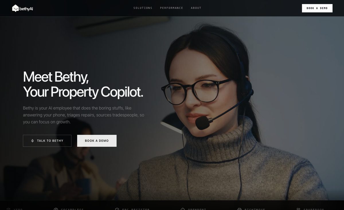
A Next.js site with Framer Motion, Lenis smooth scrolling and a live "Talk to Bethy" voice demo in the browser.

Hero"Meet Bethy" with a live voice demo button.
What it doesA photographic bento of three promises.
How it worksFrom a ringing phone to a finished repair.